SWIC needed a library of clean, student-focused imagery that felt authentic and approachable. Existing visuals were limited and inconsistent, making it hard to create a cohesive look across handbooks, orientation guides, and the website. At the same time, several printed materials were due for a design refresh to bring new energy and consistency to the college’s student-facing communications.
Southwestern Illinois College (SWIC)
Southwestern Illinois College is a public community college serving Southern Illinois across four campuses and additional off-campus locations.
Lifestyle photography and print design that brought student materials to life.
Case Study Features
+ Photography
+ Print Design
+ Page Layout
Southwestern Illinois College is a public community college serving Southern Illinois across four campuses and additional off-campus locations.
Case Study Features:
Lifestyle photography and print design that brought student materials to life.
+ Photography
+ Print Design
+ Page Layout
SWIC Case Study
A fun, multi-campus lifestyle photography and design project that resulted in a flexible image library and cohesive print materials used throughout SWIC’s student experience.
Great photography does more than fill space. It creates visual continuity across every marketing touchpoint, helping college print design, social, and web materials feel cohesive, intentional, and unmistakably part of the same brand.
Client Challenge
SWIC needed a library of clean, student-focused imagery that felt authentic and approachable. Existing visuals were limited and inconsistent, making it hard to create a cohesive look across handbooks, orientation guides, and the website. At the same time, several printed materials were due for a design refresh to bring new energy and consistency to the college’s student-facing communications.
Our Approach
Planning & Photography
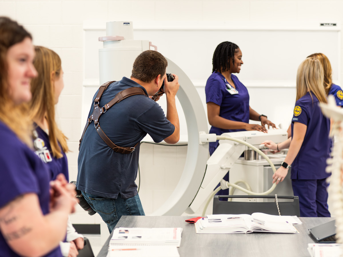
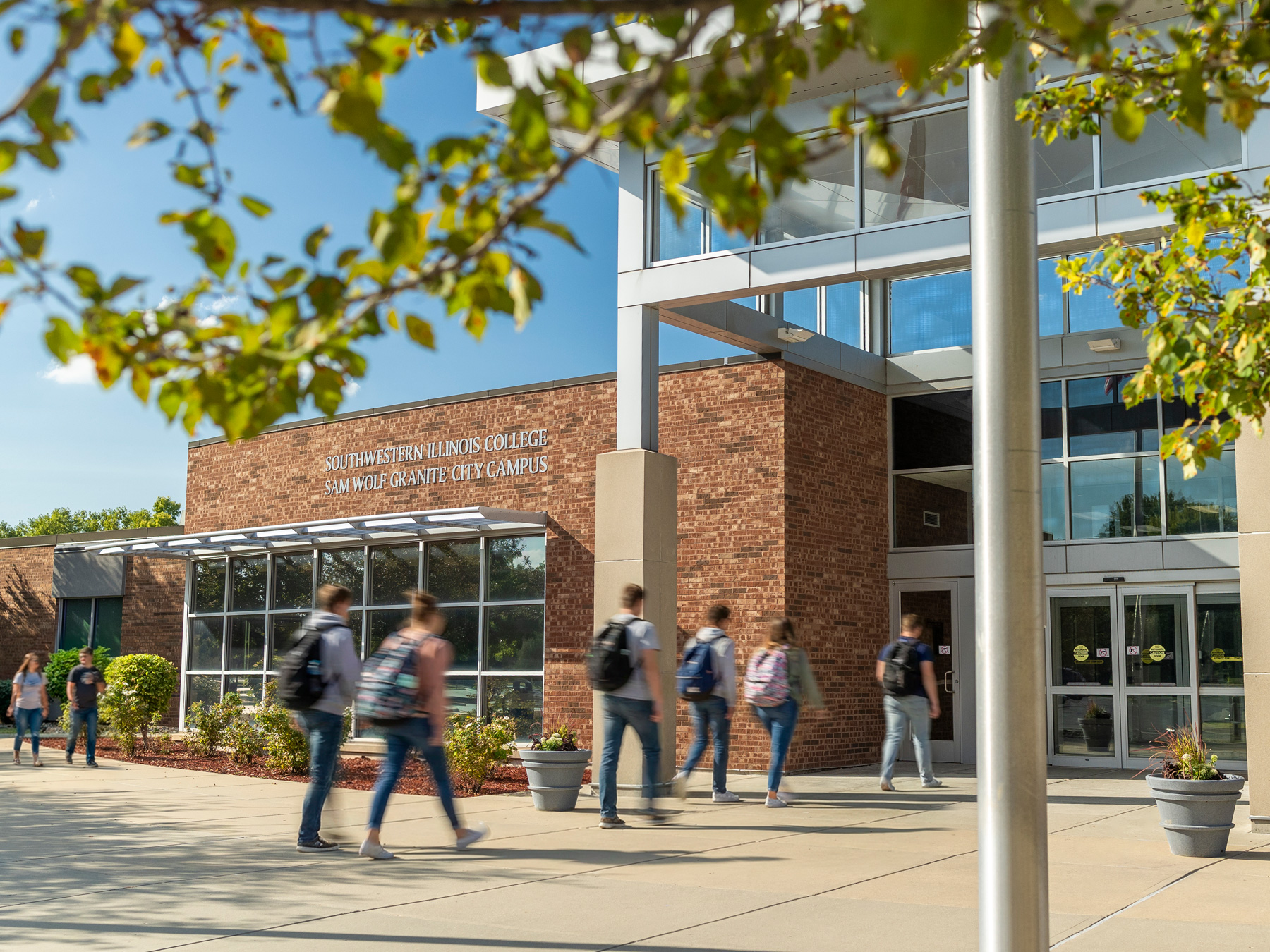
The project began with careful planning. Before stepping on campus, we developed a detailed shot list designed to produce images that would be usable across all four campuses. Each location had its own layout, energy, and flow, so planning ahead ensured we captured a wide range of scenes that could support both print and digital use.
Scheduling was just as important as the visuals. We coordinated around class times and worked with student volunteers at each campus, keeping sessions on schedule without disrupting their day. Because every campus operated a little differently, flexibility was key. We adjusted timing and locations as needed to keep the shoot running smoothly.
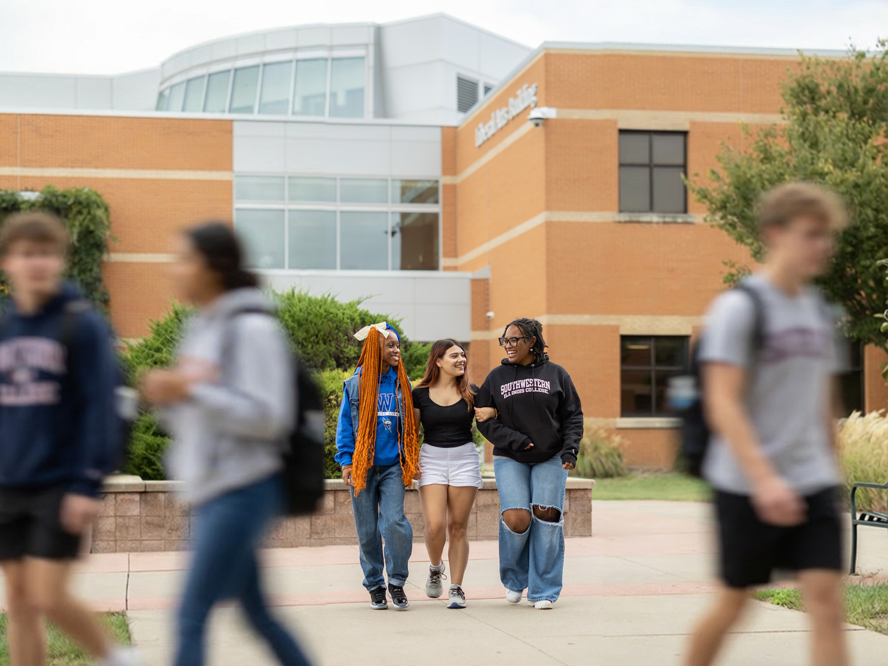
On set, the focus was on keeping things relaxed and fun. We moved quickly through takes and poses so students could get back to class, while keeping direction loose to encourage natural movement and genuine expressions. The goal was candid, approachable imagery that felt real, not staged, resulting in photos that reflect the student experience.
Our Approach
Planning & Photography
The project began with careful planning. Before stepping on campus, we developed a detailed shot list designed to produce images that would be usable across all four campuses. Each location had its own layout, energy, and flow, so planning ahead ensured we captured a wide range of scenes that could support both print and digital use.
Scheduling was just as important as the visuals. We coordinated around class times and worked with student volunteers at each campus, keeping sessions on schedule without disrupting their day. Because every campus operated a little differently, flexibility was key. We adjusted timing and locations as needed to keep the shoot running smoothly.
On set, the focus was on keeping things relaxed and fun. We moved quickly through takes and poses so students could get back to class, while keeping direction loose to encourage natural movement and genuine expressions. The goal was candid, approachable imagery that felt real, not staged, resulting in photos that reflect the student experience.
The Results
Image Library
Stonefield Design delivered a comprehensive, campus-wide photo library that was integrated into key print pieces including the Student Handbook, Orientation Guide, and Schedule Covers, all designed by Stonefield Design. Together, the photography and layouts created a consistent, polished visual identity that made SWIC’s student materials feel more welcoming, modern, and cohesive.
The Marketing team noted how fun and seamless the process was for students, resulting in natural, versatile imagery that can be used well into the future.


The Results
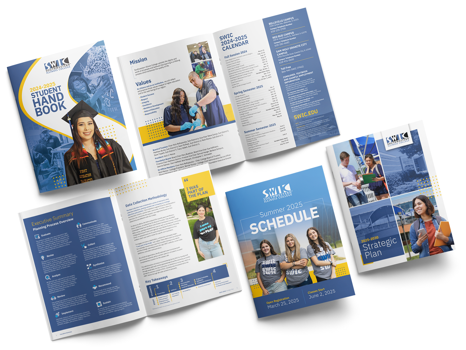
Print Design
In addition to photography, Stonefield Design led the print design for several key student-facing materials, including the Student Handbook, semester schedules, and Orientation Guide. SWIC was looking for a refreshed visual approach that felt fun, creative, and energetic while still staying rooted in the college’s existing brand.
The final designs brought new vibrance to familiar formats. By evolving established colors, typography, and layout structures, Stonefield gave these materials a fresh, modern feel without losing brand recognition. The result was a cohesive set of print pieces that better reflected the energy of campus life and felt engaging, current, and built for today’s students.
The Results
Print Design
In addition to photography, Stonefield Design led the print design for several key student-facing materials, including the Student Handbook, semester schedules, and Orientation Guide. SWIC was looking for a refreshed visual approach that felt fun, creative, and energetic while still staying rooted in the college’s existing brand.
The final designs brought new vibrance to familiar formats. By evolving established colors, typography, and layout structures, Stonefield gave these materials a fresh, modern feel without losing brand recognition. The result was a cohesive set of print pieces that better reflected the energy of campus life and felt engaging, current, and built for today’s students.
Available for Work